- Nov 2, 2024
The Psychology of Color in Branding: How Color Shapes Perception and Drives Business Success
- Lovisa Woodson II
- Branding
You may think of color when it comes to beautiful aesthetics such as your favorite color dress or the one no once could ever convince you to wear. But color is also a potent psychological tool in branding, influencing how customers perceive and connect with a brand on an emotional level. Research shows that up to 90% of first impressions are based on color alone, underscoring its impact on customer decisions and brand loyalty. In this article, we’ll dive into the psychology of color in branding, explore the psychological traits of different colors, and look at strategies for selecting colors that align with your brand’s identity.
Why Color Matters in Branding
Color affects us in profound ways—psychologically, biologically, and socially. In branding, it’s often used to evoke specific feelings and associations, becoming a defining feature of a brand's identity. Brands that successfully leverage color psychology are better equipped to:
Build emotional connections with customers
Differentiate from competitors
Reinforce brand values and purpose
Boost brand recognition and trust
Guide customer decision-making
For example, McDonald’s uses a vivid red and yellow color palette that feels energetic and cheerful, drawing in customers and encouraging a quick-paced, friendly environment. Understanding the nuances of color psychology gives businesses an edge in creating a memorable and effective brand experience.

The Science of Color Perception
Color perception is a complex process involving biological, cultural, and emotional factors. Colors have measurable impacts on mood and behavior, prompting responses in milliseconds. Biologically, colors can trigger dopamine release (as with warmer tones) or induce a calming effect (often associated with cooler tones). These responses are universal yet nuanced by cultural background, personality, and personal experience.
For instance, while red is associated with excitement and passion in Western cultures, it symbolizes luck and prosperity in Chinese culture. Understanding both universal and cultural color associations is crucial when choosing colors for a global or multicultural brand.

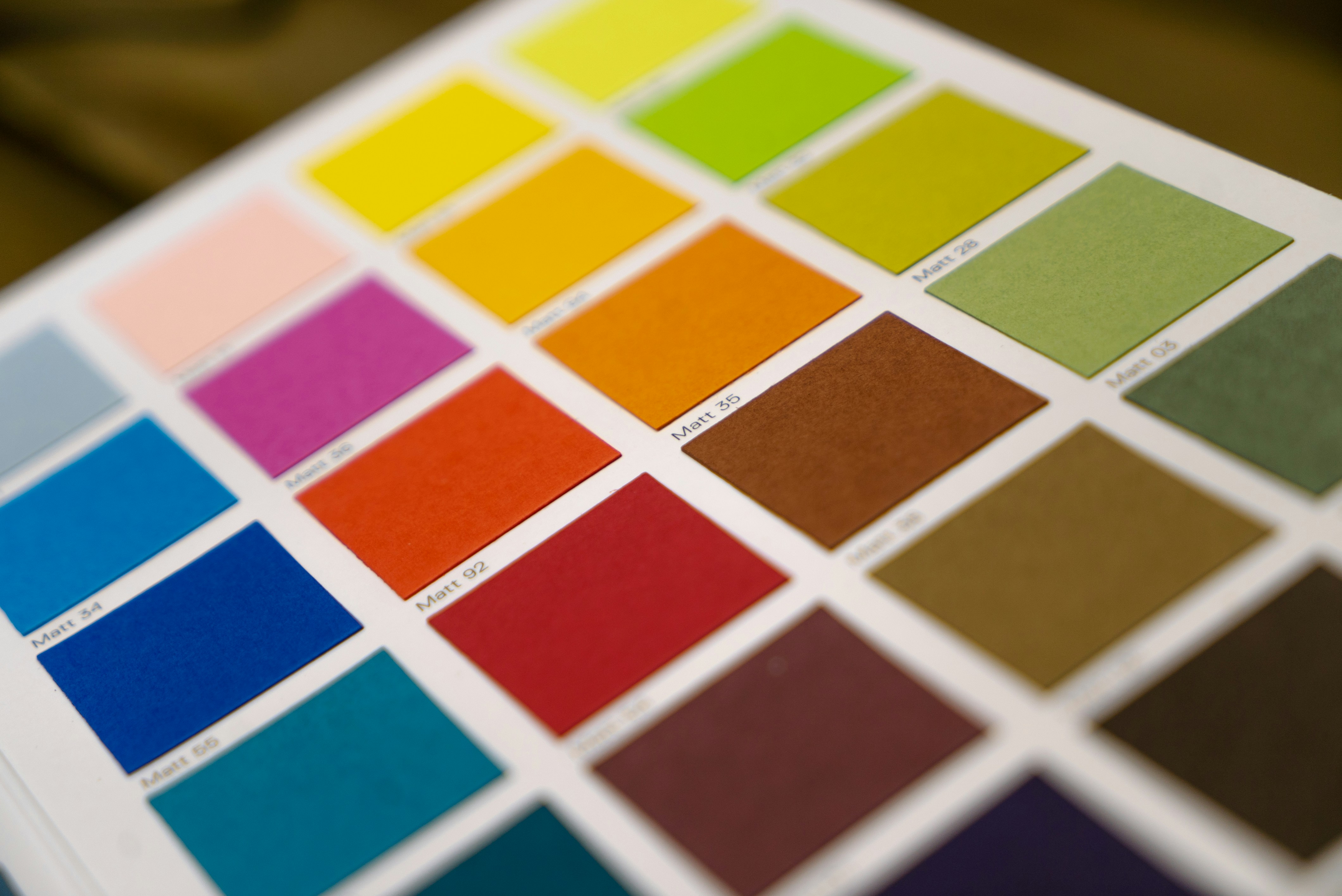
A Deep Dive Into Colors and Their Psychological Traits
Let’s look at the psychological traits associated with primary colors commonly used in branding. Each color evokes specific emotions and associations, giving it a unique place in a brand’s color strategy.
Red: Excitement, Passion, Urgency
Traits: Red is a stimulating and powerful color, often used to evoke excitement, urgency, and passion.
Applications: Fast-food brands (e.g., KFC, Coca-Cola) frequently use red to stimulate appetite and create a sense of urgency. Tech companies and lifestyle brands might also use red sparingly to add energy or convey boldness.
Blue: Trust, Stability, Professionalism
Traits: Blue promotes feelings of calm, trust, and professionalism. It’s known to lower blood pressure and has a calming effect on the mind.
Applications: Financial institutions, healthcare brands, and tech companies (e.g., Facebook, PayPal, and IBM) often use blue to evoke trustworthiness and stability. Lighter shades of blue are often used for a sense of relaxation, while deeper shades add an air of professionalism.
Yellow: Happiness, Optimism, Warmth
Traits: Yellow is cheerful and optimistic, often associated with happiness and warmth. However, when used in excess, it can cause strain.
Applications: Brands targeting families or younger audiences (like IKEA and Snapchat) use yellow to add a sense of playfulness and friendliness. In smaller doses, it can draw attention and create a sense of warmth.
Green: Balance, Growth, Health
Traits: Green represents balance, nature, and growth, making it a popular choice for wellness, sustainability, and finance brands.
Applications: Health and eco-conscious brands like Whole Foods and Tropicana frequently use green to signify freshness, growth, and a connection to nature.
Purple: Creativity, Luxury, Wisdom
Traits: Purple is linked to creativity, luxury, and wisdom. It’s a rich, introspective color that can evoke feelings of exclusivity and imagination.
Applications: High-end brands and companies in creative industries, such as Cadbury or Hallmark, use purple to convey luxury, creativity, and sophistication.
Black: Sophistication, Power, Modernity
Traits: Black represents sophistication, modernity, and power. It’s a versatile color that can add elegance to a brand.
Applications: Luxury and fashion brands like Chanel and Prada use black to convey exclusivity, confidence, and timelessness.
White: Simplicity, Purity, Clarity
Traits: White is associated with cleanliness, simplicity, and purity. It can also create a sense of spaciousness and peace.
Applications: Minimalist brands or those in the tech and health industries often use white for a clean, modern look. Apple, for example, uses white to create a feeling of simplicity and elegance.
Choosing the Right Colors for Your Brand
When deciding on a brand color palette, consider your brand’s personality, values, and target audience. Here are some steps to make sure your color choices align with your brand’s goals.
Define Your Brand Personality and Voice
Identify adjectives that best describe your brand. Is it bold and youthful, or traditional and trustworthy? This clarity will help guide your color choices to ensure your palette aligns with your brand identity.
Understand Your Target Audience
Consider the demographics and psychographics of your ideal customer. Younger audiences might respond better to vibrant and playful colors, while older or more conservative audiences might prefer subdued, classic tones.
Research Competitors
Evaluate competitors’ color choices to find opportunities for differentiation. For example, if most brands in your industry use blue, selecting green or purple could help your brand stand out.
Create a Balanced Color Palette
Use a combination of primary, secondary, and accent colors. The primary color should represent the core of your brand, while secondary and accent colors can add dimension and flexibility across branding materials.
Test and Refine
Color perception can vary, so test your palette across different media and lighting conditions. Conduct surveys or use A/B testing to see which colors resonate best with your audience.
Practical Tips for Using Color in Branding
Once you’ve selected your brand colors, the next step is to incorporate them into your brand consistently and effectively. Here are some best practices:
Maintain Color Consistency Across Platforms
Consistent use of color across your website, social media, packaging, and marketing materials will strengthen brand recognition. This consistency makes it easier for customers to associate those colors with your brand.
Use Contrast to Enhance Readability and Focus
Contrast is crucial for readability, particularly in digital media. For example, pairing a light background with a dark font improves readability, while accent colors can draw attention to calls to action (CTAs) and important information.
Think Beyond the Logo
While color is important in logos, it’s equally valuable in backgrounds, images, and other brand visuals. For instance, subtle use of brand colors in website headers or social media graphics can reinforce your brand identity without overwhelming the viewer.
Adapt for Accessibility
Ensure that your color choices are accessible to people with visual impairments, including color blindness. Tools like color contrast checkers can help you verify that your color scheme is inclusive.
Stay Open to Change
As your brand evolves, your color palette may need adjustments. Regularly assess your brand’s visual identity to see if colors need refreshing to stay relevant in the marketplace.
Case Studies: Successful Use of Color in Branding
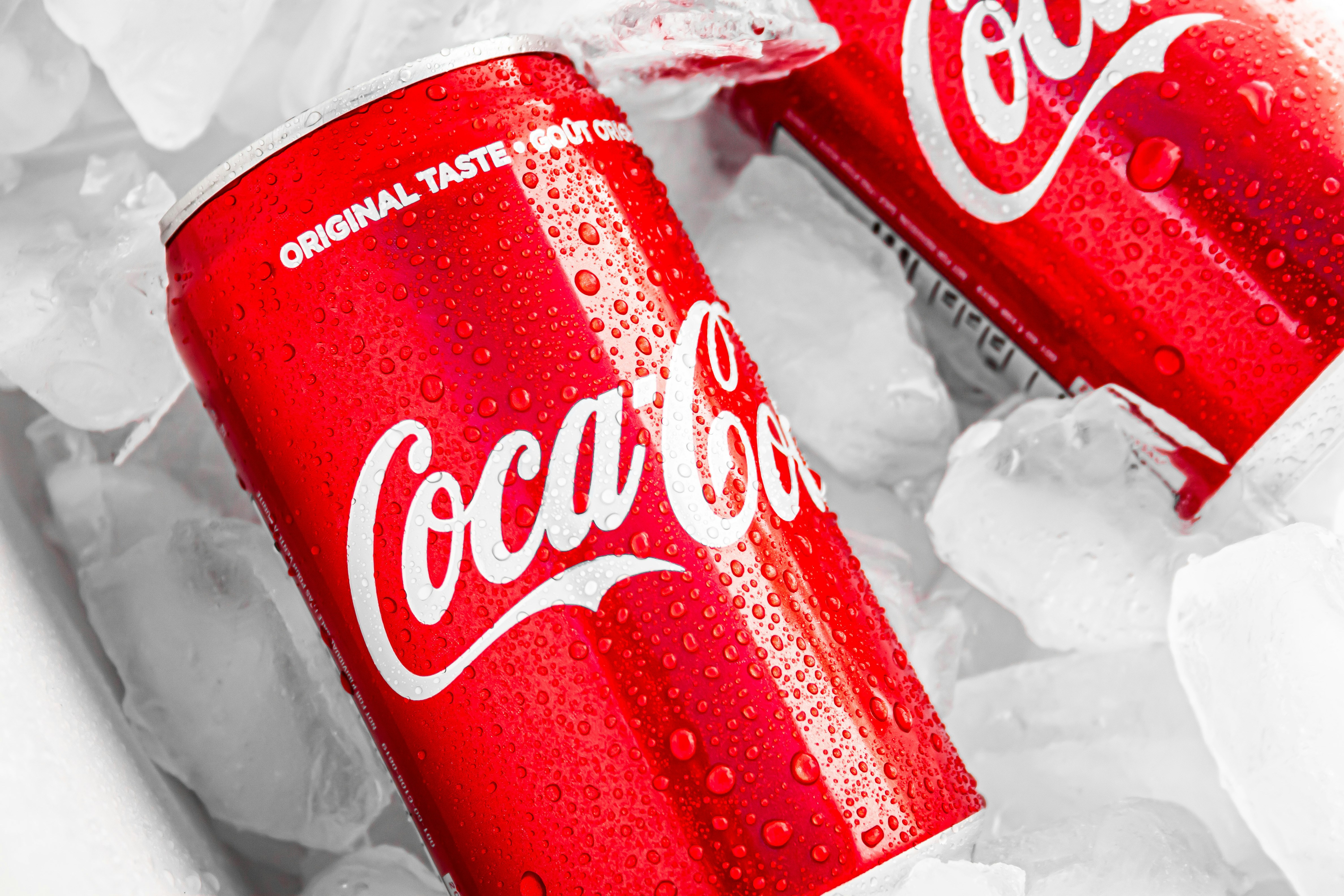
Coca-Cola: Red for Excitement and Energy
Coca-Cola has used red in its branding since the late 19th century. This vibrant color creates a sense of excitement and urgency, making it memorable and easily recognizable worldwide.
Starbucks: Green for Growth and Freshness
Starbucks chose green to align with its commitment to growth and sustainability. This color reflects the brand’s mission to create an inviting, eco-conscious atmosphere for customers.

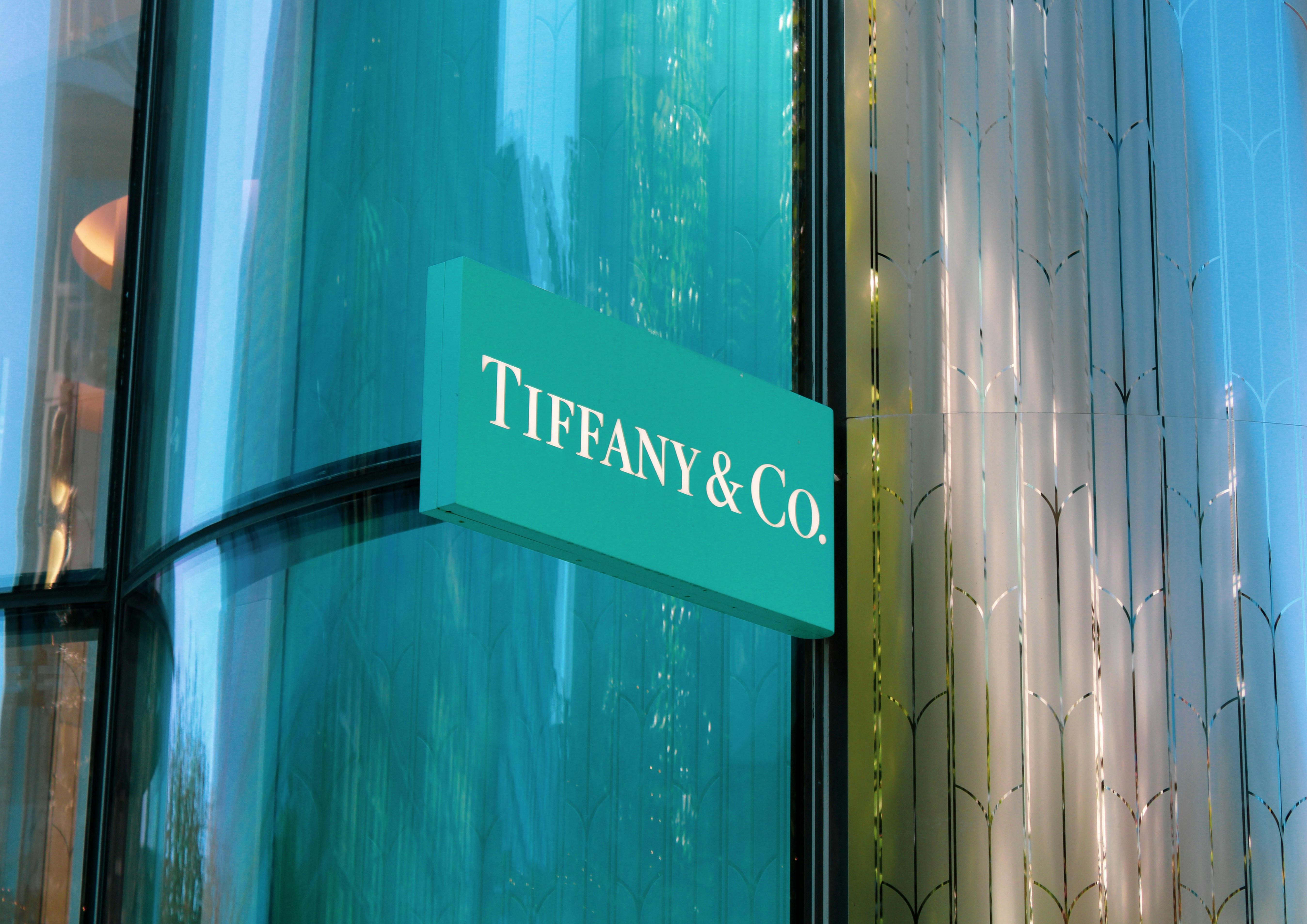
Tiffany & Co.: Blue for Sophistication and Trust
Tiffany’s signature robin egg blue is synonymous with elegance and luxury. This distinctive shade has become a hallmark of the brand, reinforcing its identity as a high-end jeweler.
The Power of Color in Shaping Brand Perception
Choosing the right colors for your brand is more than just an aesthetic decision; it’s a strategic choice that influences how customers perceive your brand and ultimately drives business success. By understanding the psychology of color, your brand can harness the power of visual appeal, creating meaningful connections with your audience.
In the end, color is a potent force in branding that shapes not only the visual appeal but also the emotional resonance of your brand. Remember to continually assess and refine your color choices to ensure they align with your brand values, customer expectations, and the ever-evolving marketplace. With careful consideration and consistent application, color can become a powerful asset, helping your brand leave a lasting, positive impression.
Ready to Elevate Your Brand with Color?
Download The Psychology of Color guide now and learn how to create a captivating brand identity that truly resonates!